Archive

Showing posts with label View From the Bridge. Show all posts

Thursday, July 31, 2014

Initial 2nd Quarter GDP Report Surpasses Expectations


The Bureau of Economic Analysis (BEA) released its first estimate of 2nd quarter GDP this week, indicating that the US economy grew at a seasonally-adjusted, annualized rate of 4%; well above the median forecast of 3% among 80 economists surveyed by Bloomberg and our own expectations. The bulk of the growth came from personal consumption expenditures, which contributed 1.69 percentage points, and inventory accumulation, which contributed 1.66 percentage points. Personal consumption expenditures grew at an annualized rate of 2.5%, the midpoint of the range over the last 18 quarters. In short, consumption was neither particularly strong nor was it weak. Consumption got a lift from purchases of nondurable goods, which rose 2.5% after a flat 1st quarter. However, after growing at a 1.3% rate in the 1st quarter, spending on services grew just 0.70%.

 Incomes grew at an annualized rate of 3.8% after growing at a 3.5% rate during the previous quarter. However, the BEA noted that “The acceleration in personal income primarily reflected an upturn in personal dividend income and a smaller decrease in farm proprietors’ income that were partly offset by a deceleration in wages and salaries.” In a report that is significantly better than expected, this is one of the few negatives. While the personal savings rate increased from 4.9% to 5.3%, its calculation has been significantly altered over the last year. In its annual revision in 2013, the BEA began including accrued pension benefits in the calculation of savings and as of this year’s revision it has also included defined contribution plans. While this is wholly appropriate from an accounting perspective, it leaves a lot to be desired from a practical standpoint. It raises the savings rate by including pension benefits that carry penalties when accessed prior to retirement. As such, prior to retirement, they are typically only accessed as a last resort and, therefore, are not part of what one would consider traditional savings.

As noted, today’s GDP report included the BEA’s annual revision, which typically covers the three prior calendar years. This one also included supplemental revisions dating to the 1st quarter of 1999. The Bureau revised 1st quarter 2014 GDP higher from a contraction of 2.9% to a contraction of 2.1%. References above reflect the revision. Real GDP growth in 2012 was revised lower from 2.8% to 2.3% while that of 2013 was revised higher from 1.9% to 2.2%. If the 2nd quarter growth rate holds (it’s subject to revisions in both August and September) and long anticipated economic acceleration occurs, growth may indeed surpass 2% this year. However, that in no way alters the conclusion in our previous post that quantitative easing has not had a substantive impact on economic growth. The fact remains that growth has been subpar, and relatively constant, despite quantitative easing.

In its press release, the BEA “emphasized that the second-quarter advance estimate released today is based on source data that are incomplete or subject to further revision by the source agency.” That is always the case for the advance report and only time will tell if some of the more volatile components are revised higher or lower. However, even if this figure is revised significantly lower, it’s likely to remain better than we anticipated. Those that have been bullish on the economy will point to this report as evidence that the 1st quarter was indeed a weather-related aberration. Yet, if that is indeed true, it suggests that a significant amount of the strength exhibited in the 2nd quarter resulted from economic activity that was pushed out from the first quarter due to weather. In short, if the weather argument is true, it suggests that the strong 2nd quarter resulted from the timing of economic activity rather than an acceleration of it. On the other hand, those of us that have eschewed the weather argument must answer a different question. If growth truly weakened in the 1st quarter, why did it rebound so strongly in the 2nd quarter? At least part of the answer lies in real final sales of domestic product, which is GDP minus the change in private inventories. Real final sales contracted 1% during the 1st quarter and grew 2.3% in the 2nd. That suggests a far smaller contraction in demand during the first quarter and a much smaller increase during the 2nd that is indicated by GDP. While the difference in the growth rates of GDP over the first two quarters of the year is a rather enormous 6.1%, the difference in final sales is 3.3%; still significant, but not nearly as dramatic. There has long been significant volatility in the rate of inventory accumulation that clearly has little to do with weather. The chart below depicts quarterly GDP growth, at seasonally-adjusted annualized rates, along with the contribution from inventories and all other sources. It is very clear that inventory accumulation has been a highly volatile component.
 

Yet, for US equity markets, the strength or weakness of the economy over the next several quarters is relatively meaningless. None of the above alters the fact that the market is significantly overvalued based on one of the most reliable valuation metrics, non-financial market cap/GDP. According to John Hussman’s most recent weekly commentary, the ratio of non-financial market capitalization-to-GDP is 1.35 and the pre-bubble norm was 0.55. The ratio peaked during the tech bubble at 1.54. Many have suggested that the market is fairly valued and that stronger economic growth is necessary for stocks to continue to move higher. However, that assertion is refuted by simple mathematics. If the US economy grew 8%, something it last did in 1951, every year for the next five years while the equity market remained unchanged, the ratio would only fall to 0.92. Simply put, regardless of the rate of economic growth, the US equity market is significantly, overvalued and that will only change with a significant decline in equity prices.

Monday, July 28, 2014

US Economy Fails to Gather Momentum Despite Fed Largesse


The International Monetary Fund (IMF) recently cut its forecast for 2014 US GDP growth, from 2% to 1.7%, while maintaining its 3% estimate for 2015. If the IMF’s 2014 forecast proves accurate, it will be the second consecutive year of weaker growth after the US economy expanded at a rate of 2.8% in 2012 and 1.9% in 2013. Since the Fed began its most recent round of quantitative easing, or QE, at the end of 2012, US economic growth has not improved. Sure, we could blame the sequestration in 2013 and a rough winter for the contraction in the 1st quarter, but that seems little too convenient. Bear in mind that the current asset purchase program is the Fed’s third outright QE program and we also had Operation Twist, in which the Fed simultaneously sold shorter maturity bonds while buying longer dated issues. Since Lehman Brothers collapsed in the fall of 2008, the Fed has expanded its balance sheet by nearly $3.5 trillion, with approximately 40% of the increase occurring over the last 19 months. Yet 2014 will be the ninth consecutive year in which US GDP has grown less than 3% and this year is likely to be the sixth year during that stretch in which it has it has grown less than 2%. If the US economy does indeed grow 1.7% this year and 4% next year, which we think highly unlikely, the 10 years from 2006-2015 would be the worst 10-year stretch for the US economy since the 10 years ended in 1954.


From the 10-years ended in 1955 through the 10-years ended in 2008, median and average rolling 10-year growth rates were always in the 2-4% range and rather consistently in the low-to-upper 3% range. From the 10-years ended in 1984 through the 10-years ended in 2006, the average growth rate was never less than 3% and the median never less than 3.5%. However, over the 10-years through 2015, using the 2014 and 2015 growth assumptions above, the median and average growth rates would be just 1.9% and 1.6%, respectively. Even if you eliminate 2008 and 2009, when the economy contracted, the median and average growth rates from 2006 through 2015 would be just 2.2% and 2.4%, respectively.
 
The credit crisis, incoherent fiscal policy, structural changes in labor markets, and shifting demographics has taken an enormous toll on the US economy. Unfortunately, aside from the credit crisis, the Fed is not equipped to deal with any of these issues. Therefore, it shouldn’t be surprising that QE has had little effect on the real economy. However, it has had a significant impact on investors’ appetite for risk, as the Fed’s purchases of Treasury and mortgage-backed securities have pushed yield starved investors into far riskier asset classes. So while the Fed has failed to re-inflate the US economy, it has succeeded at inflating financial assets, leaving most asset classes significantly overvalued. As a result, returns on stocks and bonds are likely to be far below long-term historical averages over the next three to five years.

Thursday, July 10, 2014

First Quarter GDP: The Don Nix of Economics


Does the name Don Nix ring a bell? Maybe not, but the composer, arranger, and musician wrote one of the most often covered blues/rock songs of all-time. Nix’s simple, yet catchy, “Going Down,” was first popularized by blues legend Freddie King in 1969 and has since been covered by a “Who’s Who” of guitar heroes from Jeff Beck-to-Warren Haynes-to-Joe Satriani. The song’s driving bass line and signature guitar riff, which lends itself to improvisational soloing, are guaranteed to put a smile on your face. Unfortunately, the opening line of the song, “Going down, down, down, down, down, down” also describes the estimates and reporting of US 1st quarter GDP. As a primer, the US government issues three GDP estimates over the three successive months following the end of each quarter. Prior to the government’s initial estimate on April 30th, the consensus was that the economy had grown at a seasonally-adjusted annual rate of 1.2%, well above the 0.10% indicated in the government’s initial report. Prior to the second estimate, market participants lowered their expectations to a contraction of 0.50% only to be disappointed when the government reported that the economy had contracted a full 1%.  The government’s final estimate landed with a thud last Wednesday as it reported a contraction of 2.9%, far worse than the consensus estimate of a 1.8% decline.  
 
While it has been fashionable to blame the 1st quarter’s poor economic performance on the weather, winter was already in the rearview mirror at the end of April when most believed the economy had grown, albeit modestly. Granted, factoring the impact of weather disturbances into economic forecasts is bound to widen the errors around those estimates. Yet the decline was far too severe to have been strictly weather-related. For perspective, consider the following.
 
  • The 1st quarter’s contraction was the worst economic performance since the first quarter of 2009, when the US economy remained mired in the Great Recession. It was also the 17th largest contraction in GDP since the government began keeping quarterly data in 1947, i.e. it’s in the bottom 10% of all quarterly GDP reports.

  • The Japanese economy contracted an annualized 6.9% in the 1st quarter of 2011 and 3% in the 2nd quarter that year in the wake of the earthquake and tsunami that devastated the nation in March of 2011. Bear in mind that the Japanese economy had contracted 4.1% in the 4th quarter of 2010 and was either in, or likely on its way into, recession when the disaster struck.
 
  • Snow coverage and temperatures across the continental United States were not materially more severe last winter than during the winter of 2009-2010. However, while the economy contracted 2.9% during the 1st quarter of this year, it grew 1.6% during the 1st quarter of 2010. While the winter of 2013-2014 appears to have had a greater impact on major metropolitan centers than that of 2009-2010, it certainly doesn’t account for the 4.5 percentage point difference in the respective 1st quarter growth rates.   

Almost by definition, it takes multiple culprits to create such a contraction, and indeed, weakness was present throughout the report. Most disconcerting may be the fact that consumer purchases grew a scant 1% on an annualized basis, the slowest pace of growth in five years, adding just 0.71 percentage points to growth. Surely weather delayed some purchases, especially those of durable goods such as autos, but given the rise in online spending over the last 15 years, blaming weakness in consumer spending entirely on the weather rings somewhat hollow. While the economy has been adding jobs, a significant portion of these jobs have been in low wage industries and income growth remains weak. As such, while weather played a role, weak income growth was likely the more significant factor restraining consumption. While weak consumer spending may be the most concerning aspect of the report, the real damage was done by a widening trade deficit and a lack of inventory accumulation. The widening trade deficit subtracted 1.53 percentage points from growth while the fact that inventories grew at less than half the pace of the 4th quarter subtracted another 1.70 percentage points.  

If this report doesn’t put some large nails in the coffin of the bad weather/economic acceleration argument we can’t imagine what will. Yes, severe weather negatively impacted 1st quarter GDP growth and we appear to be getting some weather-related payback this quarter. Yet as noted above, the weather was not dissimilar to that experienced across the continental United States in the first quarter of 2010, yet GDP growth was four and a half percentage points worse. Assuming weather explains the four and a half percentage point difference, which we don’t, we are left with growth of about 1.6% ex-weather. That itself would have been the worst growth rate since the 1st quarter of 2013. Simply put, the narrative of accelerating economic growth doesn’t fit the underlying data.

Friday, May 30, 2014

Europe Mandates Inclusion of Illegal Activities in GDP Calculations

It has often been said that truth is stranger than fiction and so it is with European GDP calculations. In an attempt to standardize GDP calculations across EU member nations, which is logical, Europe is absurdly mandating that countries include illegal activity in their GDP calculations. Despite decades of closer social and economic ties, there remains diversity in laws across European Union members relating to the sale and use of narcotics and prostitution. The rational for the inclusion of such activities where illegal has been to harmonize the calculations with those nations where the activity is indeed legal. However, the underlying facts are a little more sinister. The 2010 version of the European System of National and Regional Accounts (ESA) is a document of more than 600 pages that dictates the methods by which member nations should calculate economic activity. It states that “Illegal economic actions shall be considered as transactions when all units involved enter the actions by mutual agreement. Thus, purchases, sales or barters of illegal drugs or stolen property are transactions, while theft is not.” In short, any illegal activity should be included in GDP so long as the transaction is mutual agreed upon by the parties involved. Beginning later this year, all EU members will be required to include illegal activity in GDP calculations. Some already do so to varying degrees.

The problems associated with this methodology are numerous and, generally speaking, obvious. By definition, those that are trafficking in illegal economic activities do so in an inconspicuous manner to avoid detection by authorities. This would seem to make measurement of such activity highly inaccurate relative to the measurement of legal activity, which judging by the size and consistency of revisions is fraught with inaccuracy. Indeed, assumptions about the number and size of these transactions vary significantly across nations currently including them in GDP. Apparently the EU is mandating inclusion of illegal activity but has yet to provide guidelines as to the appropriate methodology for calculations.

Not only accurately estimating the size of illegal activity impossible, but this will surely lead to double counting in instances in which perpetrators of such activity are caught and fined. The ESA states that “The payment of taxes, fines, and penalties are by mutual agreement, in that the payer is a citizen subject to the law of the land.” How does one justify estimating the size of a drug lord’s narcotics transactions, including them in GDP,  and then arresting, jailing, and fining him after he is caught? How can you count the fines and penalties levied on the dealer as part of GDP while also counting the revenue from the illegal business for which he has been fined?

Yet the really insidious part of this may lie in the fact that, if not a clear attempt at budgetary chicanery, its  nearly certain to become one. Bloomberg suggests that adding underground economic activity would increase Italian GDP by 2%. This would likely drop the nation’s deficit below the 3% statutory limit in the Maastricht Treaty and result in a primary surplus (i.e. a surplus prior to the payment of interest on government debt). By artificially raising GDP, it would automatically lower the nation’s debt to GDP ratio. By raising Italian GDP, the inclusion of illegal activity allow the Italian government to either spend more while maintaining current fiscal ratios or spend the same amount and claim progress in lowering them. It’s very hard to believe that governments won’t use this phantom increase in GDP to loosen their purse strings given the austerity fatigue that has beset their citizens. Regardless, since illicit activity cannot be taxed, their will be no increase in revenue associated with the supposed increase in economic activity. In short, the economy will increase with no associated revenue increase for the government.

While this change impacts the entire EU, its another indication of the challenge facing the monetary union, which only includes those EU members using the Euro as their currency. A monetary union among economically disparate nations will always be unstable in the absence of fiscal union. At best, the inclusion of illegal activities in GDP is an illogical attempt to capture  a broader understanding of economic activity. At worst, its another ill-fated attempt to systemize economic data across disparate economies while avoiding the Elephant in the room, i.e. the need for fiscal union. In the absence of fiscal union, which will likely require Eurozone nations to become states in a federalized Europe, the monetary union will remain unstable. Yet fiscal union is nowhere on the horizon. As such, rather than being dead, the European debt crisis is simply in hibernation.


Wednesday, February 12, 2014

Eurozone Debt Update

The debt and deficit challenges that drove the Eurozone to the brink in 2011 have largely faded from the news since the restructuring of Greek debt in March 2012. However, we have continued to monitor debt/GDP levels in the Eurozone, and specifically in the periphery nations. In August 2012, the European Central Bank’s announced its OMT, or "Outright Monetary Transactions" program, a program that would allow it to purchase unlimited amounts of member states’ debt in the secondary market under certain conditions. Since the program was announced, yields on Italian and Spanish debt have declined precipitously and, it would appear, investors have taken this as a signal that the danger has all but past. Sadly, but not surprisingly, the debt of the peripheral nations has largely continued to rise unabated.

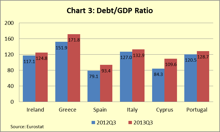
Eurostat, the official statistical agency of the European Union, recently published debt/GDP ratios for members of the European Union. On a quarter-over-quarter basis, Europe made negligible progress in taming its burgeoning debt as the ratio for countries sharing the common currency declined from 95.7% in the second quarter of the year to 95.1% at the end of the third quarter. However, we must also add that this may indeed be due to seasonal issues. Eurozone debt/GDP bas declined in the third quarter in nine of the last 14 years despite the steady upward trajectory of the debt ratio. Four of the five instances in which the ratio increased in the 3rd quarter have occurred in the last six years, yet Eurozone debt/GDP increased 24.9 percentage points from the 3rd quarter of 2008 through the 3rd quarter of 2013. In short, the modest improvement from during the 3rd quarter may be due to seasonal factors. With that said, charts one and two show modest improvement for most nations.  

With seasonality a potential issue, we have looked more closely at year-over-year changes in the ratio. While this could result in missing a turning point, reducing Europe’s debt/GDP is going to be a very long-term process, more akin to turning an aircraft carrier than a 19 foot ski-boat. Given significant absolute debt levels, low growth, and an inability to devalue their currency, peripheral nations will find climbing out of their debt overage an enormous, and indeed long-term, project. As such, missing the exact moment when positive change occurs, if it occurs, isn’t likely to be problematic.


Year-over-year, Eurozone debt has grown a relatively modest 2.7 percentage points, from 89.9% of GDP to 92.6% over the 12-months ending in September. However, for most of the periphery, debt/GDP increased significantly. Cyprus, Greece, and Spain all experienced double-digit increases in debt relative to the size of their economies. Ireland, Italy, and Portugal saw smaller, albeit significant, increases in their debt ratios as well. 
Another way to look for change in the ratio is to review the slope of the debt/GDP ratio to see if it is steepening or flattening.  Only in Ireland, where the ratio has essentially remained stable over the last three quarters, do we see signs of a potential peak. The modest decline in the 3rd quarter aside, the rate of change in the ratio in Portugal remains relatively constant as it does for Greece, Spain, and Italy. That of Cyprus appears to be accelerating. As such, we must conclude, that, the periphery has made little progress in reducing its debt. There have been very modest signs of growth, ECB policy has significantly lowered the cost of debt for those with market access, and others continue to receive aid. Yet for most of these countries, nominal GDP growth is likely to remain below the cost of debt over the next two years and most will continue to run primary deficits (i.e. they will run deficits before taking into account the cost of funding). As such, most will see their debt/GDP ratio continue to climb and any progress at lowering it will be very, very hard to come by, leaving them susceptible to it climbing again, and rapidly, with any exogenous shock to the economy. In short, it is far too early to suggest that these nations have put their debt troubles behind them. As we have noted before, the European debt crisis isn’t dead, it’s just hibernating.

Please note that in the chart for Greece, the brief, but sharp, decline was due to restructuring of the nation’s debt in March 2012. Despite that restructuring Greek debt/GDP reached new highs just 18 months later.


Friday, October 4, 2013

A Guide to the US Federal Government “Shutdown”

A “shutdown” of the federal government began at midnight on October 1st. We placed the word shutdown in quotations because the government hasn’t truly shutdown. Rather, it has suspended all “non-essential” services and furloughed employees associated with those services. As a result, about 800,000 of the approximately 3.3 million federal employees, or just about 25%, have been furloughed. What follows is a guide to the issues involved in the shutdown and a discussion of the debt ceiling.

Why did the government shut down?
The government shut down because Congress failed to pass either a budget or a resolution to continue funding the government past fiscal year 2013, which ended on September 30, 2013. While passing a budget is one of Congress’ signature responsibilities, it’s one they haven’t met with regularity in recent years. In the absence of a formal budget, Congress must pass a continuing resolution, providing ongoing funding at current levels, to keep government agencies operating.

Will Congress and the President Still Get Paid?
You betcha!

Has the government shut down before?
Yes. While this is the first shutdown since the mid-1990s, it’s the 18th since 1975. From 1976 through 1987, the government shuttered operations on 14 different occasions. Shutdown’s occurred each year during the period with the exception of 1980 and 1985. Interestingly, five shutdowns occurred from 1977 through 1979 while the Democratic Party was in control of the White House and both houses of Congress! While many of the shutdowns lasted less than five days, five have lasted more than 10 days. To state the obvious, the current shutdown, while unusual, is far from unprecedented.

What is the likely impact on the Economy?
Simply put, that depends on how long the shutdown lasts. If it lasts a week, the economic impact will likely be modest. While furloughed employees are not paid, they will receive back pay (at least they always have following past shutdowns) once the shutdown ends. That, coupled with the fact that the shutdown is occurring at the beginning of the quarter, suggests that most of the reduced consumer spending that may occur due to the furloughs will be recouped prior to the end of the year. On the other hand, Mark Zandi, Chief Economist of Moody’s Analytics, estimates that if it were to last three or four weeks, it could shave 1.4 percentage points from annualized 4th quarter GDP.

What about the Debt Ceiling?
Federal debt has been statutorily limited since the Second Liberty Bond Act in 1917. Prior to the Act, Congress had to pass legislation approving each debt issuance. The Act was expected to make it easier to raise debt while simultaneously keeping debt accumulation under control. While the debt ceiling was briefly lowered following WWII, it has been consistently raised since it was enacted. This, in and of itself, is not surprising. Nor, until about the early 1980s, was it problematic. The debt ceiling is a flat dollar amount. As the economy has expanded over the last 100 years, the nation’s ability to service debt has grown dramatically. However, beginning in the 1980s, the pace at which the debt ceiling has grown has accelerated, yet this acceleration has not been matched by the rate at which the economy has grown. As a result, our debt/GDP ratio, i.e. debt relative to the size of the US economy, has grown dramatically.

While the debt ceiling and the budgetary impasse are technically separate issues, they are indeed intertwined, politically and economically. Politically, it has become a bargaining chip in budget negotiations. Economically, budget decisions largely help define the degree to which the debt ceiling must be raised. The reality of the last 70 years is that Congress has generally passed budgets and the debt ceiling has been raised to accommodate increased spending. This has been true regardless of which party has controlled the White House or Congress.

The Treasury has suggested it will exhaust its resources by mid-to-late October, resulting in the need to issue debt, which it will not be able to do unless the impasse over the debt ceiling has ended. If that were to occur, there is a legitimate possibility that the Treasury would be forced to delay November 1st Social Security payments according to Capital Economics. If it were unable to make interest payments on November 15th, the US would be in default. Given the very dire consequences of not raising the debt limit, we believe that Congress will act, if not by mid-month then by the end of October, if only for their own self-preservation.

Summary:
As of this writing, both sides appear to have dug in their heels for a long fight over the budgetary impasse that has resulted in the “shutdown.” However, polls suggest that voters are unhappy with both parties over the shutdown and that may be enough for cooler heads to prevail, but only time will tell. We are not political analysts and we will not prognosticate on the length of the shutdown. Suffice it to say that the degree to which the shutdown impacts the US economy will largely depend on how long it lasts. Meanwhile, the debt ceiling has the potential to be a far greater issue. Politicians have a tendency to compromise when forced to do so. Congress has repeatedly pushed the envelope on financial deadlines over the last two years, battling until coming to some form of agreement at the 11th hour. Admittedly, continuing to do so increases the likelihood of going to the proverbial well once too often, missing a deadline and creating a true crisis. However, it’s likely that over the next several weeks Wall Street financiers, economists, global central bankers, and corporate CEOs will make it abundantly clear to Congress that failure to raise the debt ceiling would be disastrous. In short, while we wouldn’t be surprised by an extended shutdown, we expect the debt ceiling to be raised, taking the most potentially damaging issue off the table, at least for the immediate future. But this is no way to run a country, let alone the greatest military and economic power the world has ever known.

Wednesday, September 18, 2013

Barron’s Article Indicates Stocks and Bonds at High Level of Historical Valuation


Two weeks ago Barron’s published an interview with Cliff Asness, one of the founders of AQR Capital Management and the former director of Quantitative Research at Goldman Sachs. Barron’s asked Mr. Asness what kind of return investors could expect from a traditional 60/40 stock/bond portfolio. While noting that his answer referred to US stocks and bonds, he stated that the answer is not that different for a global portfolio. Mr. Asness said that while a 60/40 portfolio has historically produced a real return, i.e. after inflation, of about 5%, investors should expect about half of that going forward.

He went on to explain that while US equities have been cheaper than they are today over about 80% of their history, bonds have been cheaper about 90% of the time. However, because both stocks and bonds are at the upper end of historical valuation ranges at the same point in time, the valuation of a traditional 60/40 stock/bond portfolio has been cheaper about 98% of the time.

While these traditional portfolios have worked extremely well year-to-date, the fact that their valuations are in the top 2% of historical observations is a very strong indicator that they will not perform well in the future. Markets can stay over or undervalued for significant periods of time and we do not know when the valuations will revert to historical norms. However, such reversion will result in significantly weaker performance than a 60/40 portfolio has produced over the last three to four years. As such, portfolios should be positioned ahead of this change.

The information above strongly suggests that long/short strategies, many of which have lagged significantly this year, are likely to perform better than traditional, long only, strategies going forward. Additionally, we would note that the sell-off in emerging debt has made the asset class attractive once again (see our blog posting Why We Like Emerging Markets Bonds). Finally, despite the dramatic sell-off in the US bond market, PIMCO Total Return and Baird Core Plus are only down about 3% YTD. In short, it’s very likely that correcting the relative overvaluation in equities will result in far greater price declines than correcting the over valuations in bonds.

Tuesday, September 10, 2013

Why We Like Emerging Markets Bonds

When we initiated positions in emerging sovereign bond markets in late 2008, we were relatively early in embracing the asset class as a core holding within portfolios. At the time, many investors saw emerging markets debt, or EMD, as a niche asset class. Yet our research indicated that it had changed dramatically over the previous decade. More emerging countries were allowing their currencies to trade freely in the market rather than pegging them to the US dollar. Their economies had become more competitive, corporate governance had improved, and emerging nations were generally more politically and socially stable than they had been a decade earlier. Importantly, many had successfully addressed longstanding structural issues over the previous decade. Public (i.e. government) balance sheets had improved dramatically. In many instances, government budget deficits and government debt as a percentage of GDP were now smaller than in many developed nations. Not only that, but emerging economies held greater growth potential than developed economies, making it very likely that growth in public revenue would rather easily cover their governments’ fiscal obligations. In short, we were able to buy debt supported by strong balance sheets with very attractive yields.
 
Emerging sovereign debt markets performed exceptionally well over the following four years with the exception of a modest loss in local currency denominated bonds in 2011. From 2009 through 2012, emerging sovereign bond markets posted double-digit annualized returns. Emerging markets bonds denominated in the currencies of their issuers, as measured by the JP Morgan GBI-EM Global Diversified Index, provided equity-like returns with significantly less volatility while those denominated in US Dollars, as measured by the JP Morgan EMBI Global Diversified Index, fared better yet, producing better returns than US and developed equity markets while incurring dramatically lower volatility (Dollar-denominated debt is typically less volatile than its local currency-denominated counterpart because it lacks the volatility associated with currency fluctuations) (Table 1). The strong returns coupled with lower volatility resulted in better risk-adjusted performance as measured by the Sharpe Ratio. Why is volatility important? From a mathematical standpoint, lower volatility means more efficient compounding of returns. If, on average, two investments have the same expected return, lower volatility yields a higher compound rate of return (Table 2). While mathematics supports the case for a lower volatility portfolio for a given return expectation, the proposition is also emotionally appealing. Surely it’s easier to sleep at night with the first portfolio than with the second or third. And you get paid more to rest easy.

Table 1: Performance 2009 - 2012
Annualized Return
Standard Deviation
Sharpe Ratio
EMBI Global Div Index
16.42
6.67
2.45
GBI-EM Global Div Index
12.80
12.96
0.98
MSCI EAFE
10.51
21.02
0.49
MSCI Emerging Mkt
19.97
24.22
0.82
S&P 500
14.58
16.96
0.85

Table 2
Year 1
Year 2
Year 3
Simple Average
Annualized Average
Portfolio 1
8%
8%
8%
8%
8.00%
Portfolio 2
8%
-8%
24%
8%
7.20%
Portfolio3
8%
-16%
36%
9.33%
7.25%

Of course, this year has been a very different story as both stocks and bonds in emerging countries have declined significantly. Investors have been concerned that the European recession, weak growth in the US, and increased competition from Japan due to the rapid devaluation of the Yen will crimp growth prospects for emerging economies. However, we believe that the real driver behind this year’s performance in emerging stock and bond markets has been concern that the Fed may reduce, or even end, its quantitative easing program (i.e. bond buying program), resulting in the reversal of carry trades. Carry trades involve borrowing in a currency where interest rates are exceptionally low to take advantage of higher yielding investments denominated in another currency. Also, US dollar-denominated emerging debt trades at a spread (i.e. yield premium) to US Treasuries. As the concerns over the Fed’s purchase program have pushed up Treasury yields, yields on emerging US Dollar-denominated debt have also risen. Finally, global bond markets have less liquidity than they did prior to the credit crisis due to legislation that had altered the willingness of financial institutions to make markets in, and hold inventory of, bonds across many asset classes. The result has been somewhat of a perfect storm for emerging bond markets. The local currency denominated benchmark, the JP Morgan GBI-EM Global Diversified Bond Index, is down 11.45% year-to-date while the US Dollar-denominated benchmark, the JP Morgan EMBI Global Diversified Bond Index, is down 9.03% year-to-date through August. The loss in the former is largely due to currency depreciation against the US Dollar with the benchmark down a far more modest 2.84% when measured in local currency. The loss in the US Dollar denominated benchmark is due to rising Treasury yields and the widening of spreads between US Treasuries and emerging government bonds. As a result of these price declines, yields on both benchmarks have risen to rather attractive levels for fixed income securities rated, on average, at the low end of the investment grade spectrum (for the local currency benchmark) and at the highest end of the high yield spectrum (for the dollar-denominated index). The benchmarks yield multiple percentage points more than the 10-year debt issued by similarly rated nations from the troubled European periphery. Note that while the table below compares the yields on the benchmark to the yields on benchmark 10-year bonds of the European periphery, the average maturity of the two emerging markets benchmarks are less than 10-years (Table 3).
Table 3
S&P Ratings
S&P Ratings
 
 
Local Currency
Foreign Currency
Yield
Italy
BBB
BBB
4.51%
Spain
BBB-
BBB-
4.53%
Ireland
BBB+
BBB+
4.02%
Portugal
BB
BB
6.96%
Greece
B-
B-
10.46%
EMBI Global Div Index
NA
BB+
6.27%
GBI-EM Global Div Index
BBB+
NA
6.99%

As an asset class, the bonds of emerging sovereign governments offer investors an opportunity to earn far higher yields lending to countries with stronger growth prospects, and in many instances, stronger balance sheets, than they can lending to overly indebted developed countries with poor growth prospects. Global bond markets are likely to remain volatile as investors parse every word from the Fed and assess what any policy changes may mean for global markets. Emerging debt markets are likely to remain volatile as the markets continue to evaluate potential and actual changes in Federal Reserve Policy and the volatility may be exacerbated by a the lower liquidity that has pervaded bond markets due to US legislative changes. Yet the current weakness offers an opportunity for investors to purchase assets with sound fundamentals and attractive yields at discounted prices. Moreover, the recent gulf in performance between emerging bond markets and developed equity markets suggests that their return potential over the subsequent three to five years is likely similar to, or better than, US and developed international equity markets. Coupled with the lower long-term volatility profile of emerging bond markets relative equities, the asset class offers not only attractive absolute returns, but very attractive risk-adjusted returns over the long-term.